
A feature enhancement reworking an underutilized feature for better engagement
Chase Plan & Track
Role: UX/UI Design, User Research, Brand Identity, Usability Testing
Project Duration: 80 Hours (Passion Project)
Background:
As one of the largest banks in the U.S., serving over half of America’s households, Chase wants to use their reach to improve their customer’s financial health. Their current budgeting tool is very basic in functionality and a discovery survey has shown that customers rarely utilize this feature. Although their offerings focus primarily on spending and making payments, Chase would like to round out their offerings by providing users with personalized features that allow them to manage their personal finances.
Problem
Chase’s current spend & budgeting feature, Plan & track, is not interconnected with other Chase features for a sophisticated financial management user experience. This leads to users outsourcing the management and allocation of their financial wealth. As a result, Chase is limiting their potential revenue and their ability to capitalize the personal banking market.
Solution
A mobile design to redefine feature flows to increase awareness and promote engagement with Chase’s plan & track feature.
Empathize (Research Method & Findings)
Research Goals:
“I want to understand what current and potential commercial clients value when managing their personal finances to identify what Chase can improve within their plan & track feature.”
Methodologies:
Survey - Google form survey for current Chase clients
Competitive Analysis - 4 competitors chosen based on frequency of blog recommendations and the similarity in the nature of the product
User Interviews - moderated virtual interview with participants who have used spend tracking & budgeting tools
Survey:
I chose to incorporate a discovery survey for existing Chase users to identify their financial motivations, product satisfaction and if/how they use the plan & track feature.
Check out the discovery questions
Findings:
Users want easy and effortless ways to manage their finances
The mobile application is highly more utilized compared to the website
100% of users do not use the plan & track capabilities
With most users utilizing the mobile application more than the desktop website, I decided to focus on improving the mobile experience because of the survey results and time constraint.
Competitive Analysis:
After identifying what each competitor offered, I rated each category based on my own experience and common customer reviews from the App Store. This gave me a clear idea of which top competitor we should measure Chase’s capability against.
User Interviews
Participants:
5 participants
Ages 20-29
Previously used a tool to track spending or budget finances
It was revealed that users were motivated to track their spend and budget expenses for financial stability through saving goals.
Affinity Mapping Insights:
While further analyzing user interview feedback, I discovered the main frustrations users had with their tool was the inability to easily customize categories, overspending from their budget, and lack of spending analysis understanding. This informed me to consider enabling easier customization and better showcase where users stand within their budget(s).
Define
Problem Statement
“Chase’s Plan & track feature aims to help clients better manage their personal wealth, but clients are unaware or unfamiliar with the tool.”
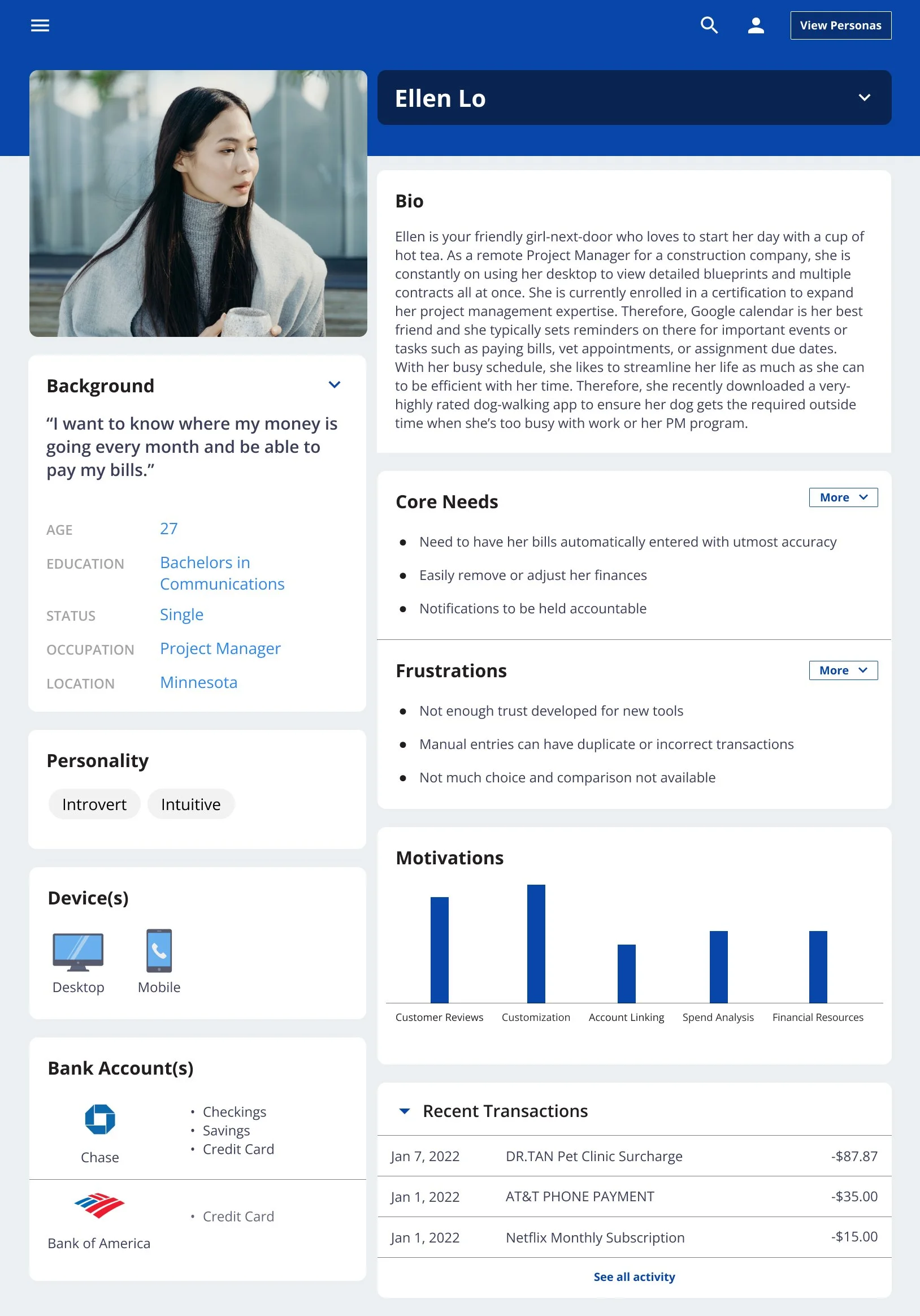
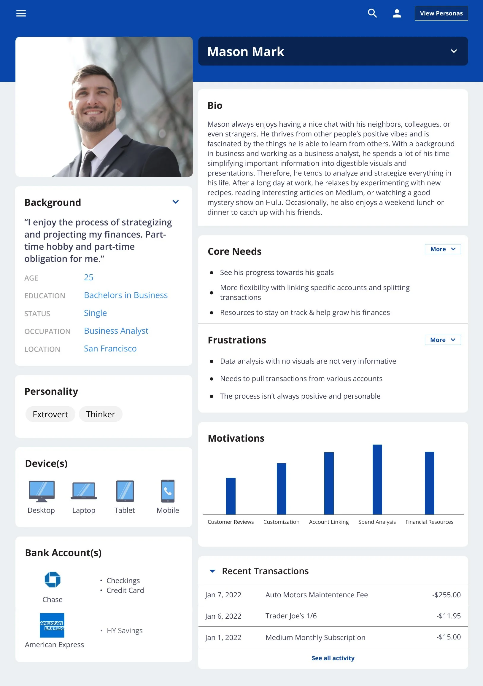
Persona
I created two personas, Ellen Lo & Mason Mark, encompassing two different segments of consumers Chase has. Ellen represents a majority of Chase’s individual consumers(user interviews participants as well) who primarily use Chase for spending and saving purposes. On the other hand, Mason is more money conscious and well-versed in financial terms and tools aimed to consider more novice users.
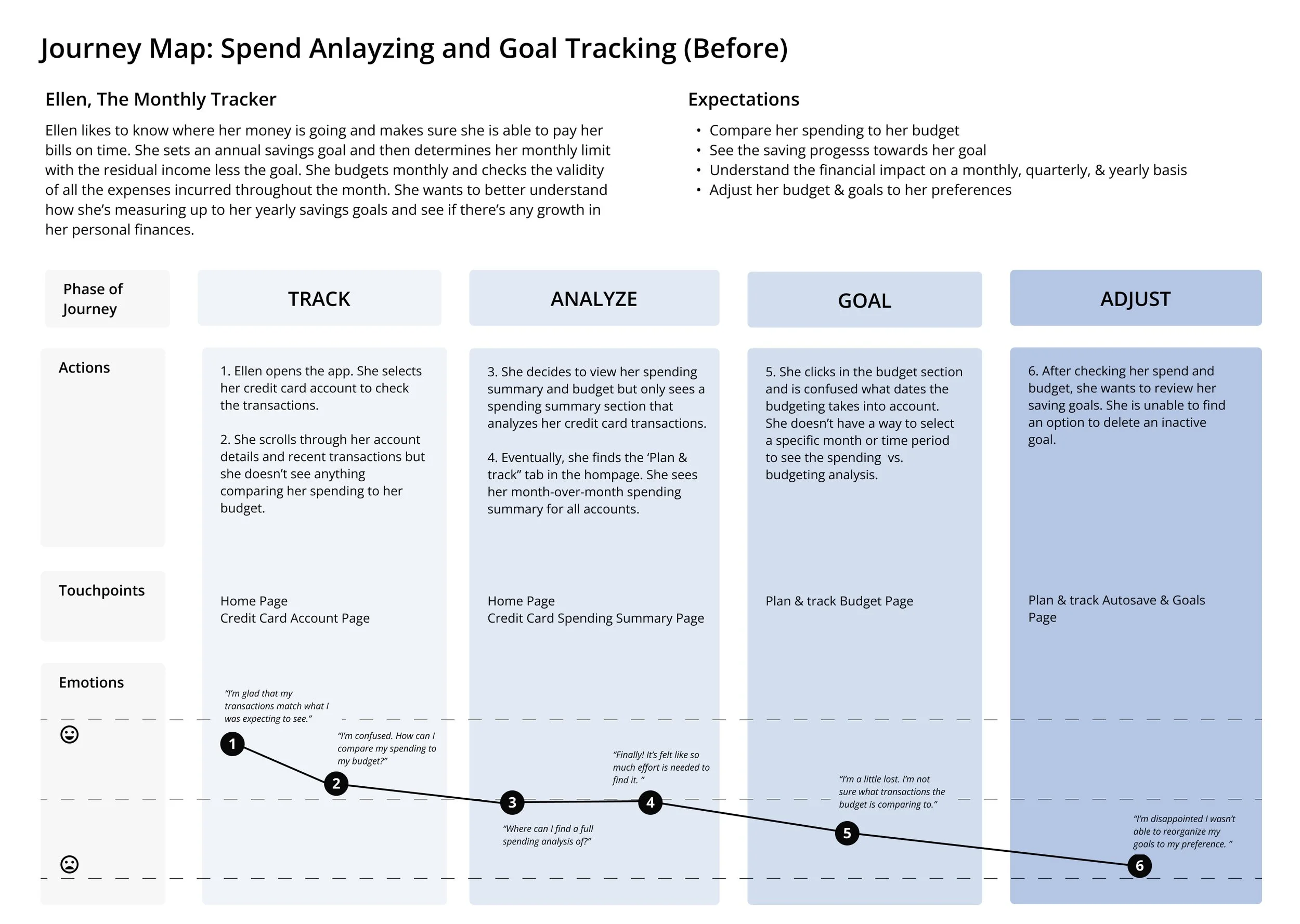
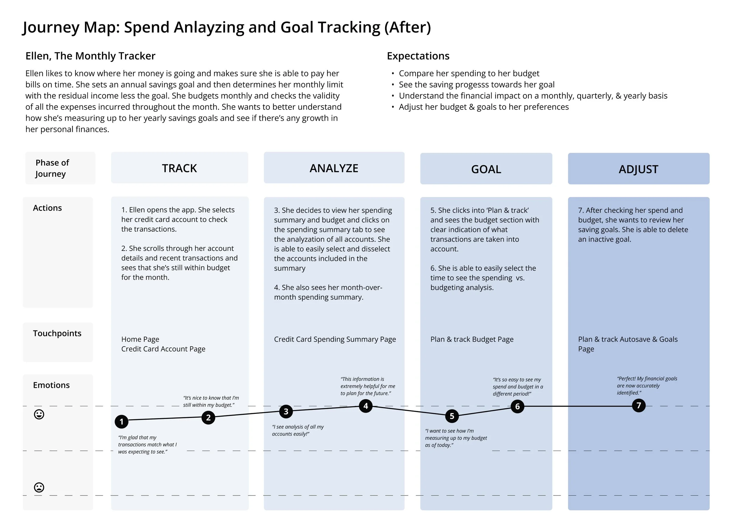
Journey Mapping
With a time constraint on this project, I only focused on Ellen’s journey to curate an improved experience for a larger demographic.
Ellen’s journey with the current Chase experience helped me identify inconveniences such as inability to measure her spending against her budget within an account, too much effort navigating to the analysis for all accounts, and ease of updating her savings goals. In the new journey, her emotions points 2, 4, 6, & 7 showed new opportunities that can enable her to easily complete her tasks and increase her satisfaction.
Sitemap
The lack of connection between various accounts to the plan & track feature was a critical point, as seen from journey mapping, I needed to resolve through a revised sitemap.
Product Requirements
When diving into the specific UI & page requirements, I realized that I was trying to tackle too many user tasks which would require a lot of time than I had. As a result, I prioritized user task #1 & #3 based on the amount of impact I anticipate it would have for this project.
Ideate
Brand Kit
Another constraint for this project was to ensure all designs adhered to Chase’s existing brand and style. However, their current UI consisted of a one color scheme which limited my design of the solution. A secondary color may be helpful to help draw out more attention to certain tasks, increase visibility for elements, or better indicate separation of sections.
Low-fidelity Wireframes
In my sketches and low-fidelity wireframes, I focused on integrating an entry point to the plan & track feature within a specific page of an account(i.e. checking account, credit card).
High Fidelity Wireframes
To ensure the best solution, I mocked up various variations to seek feedback from a group critique session.
I found that…
It’s could be visually confusing if there’s more than one square indicating completely separate purposes
The visual bar helps users quickly identify whether they are within their monthly budget
Users may be confused between “Spending Summary” and “Spending by category”
With all the feedback, here were the changes I made:
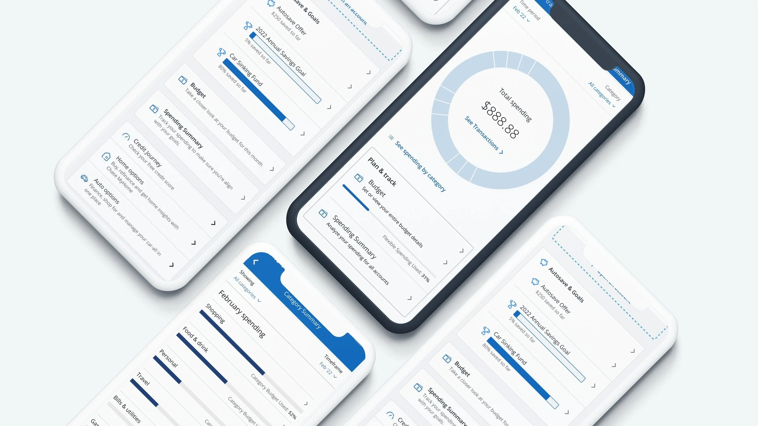
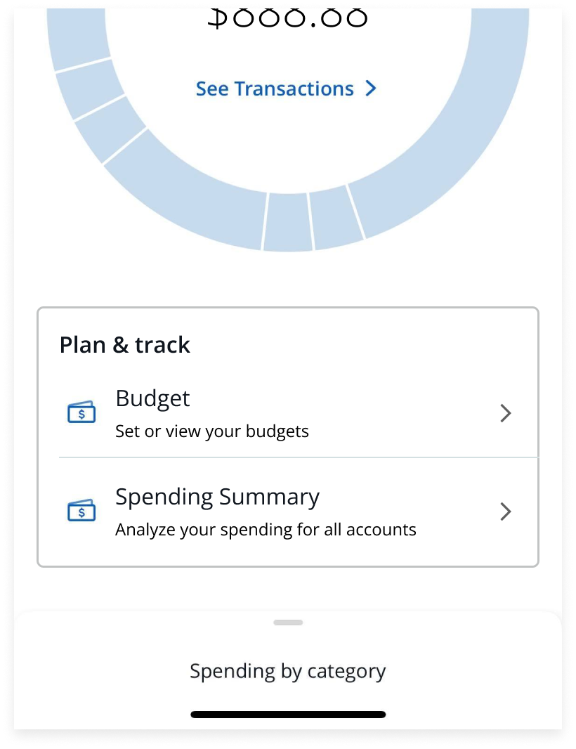
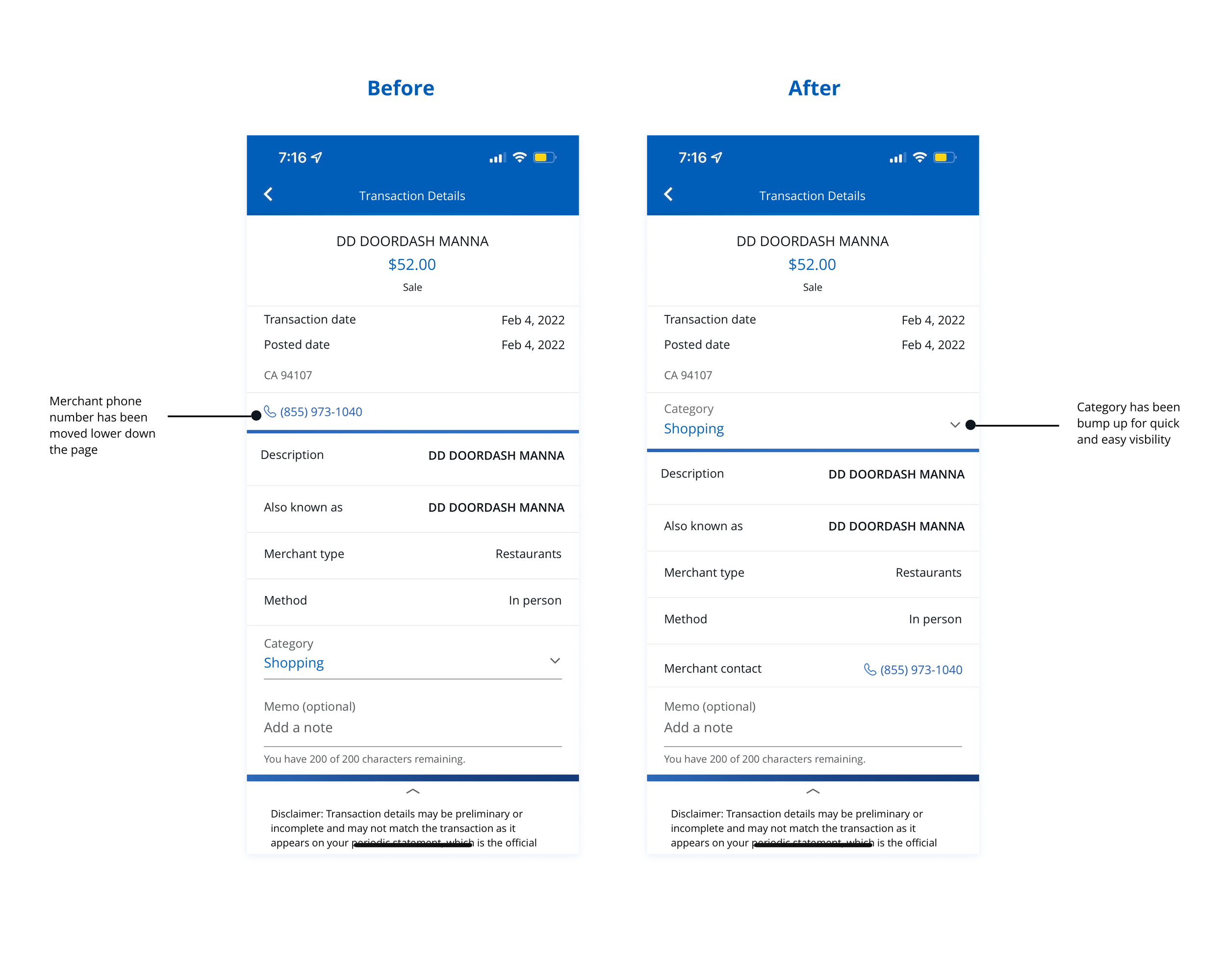
Bumped up the “Spending by category” to be grouped with the spending wheel for relevance purposes
Visual bar is now paired with textual indication for better clarity
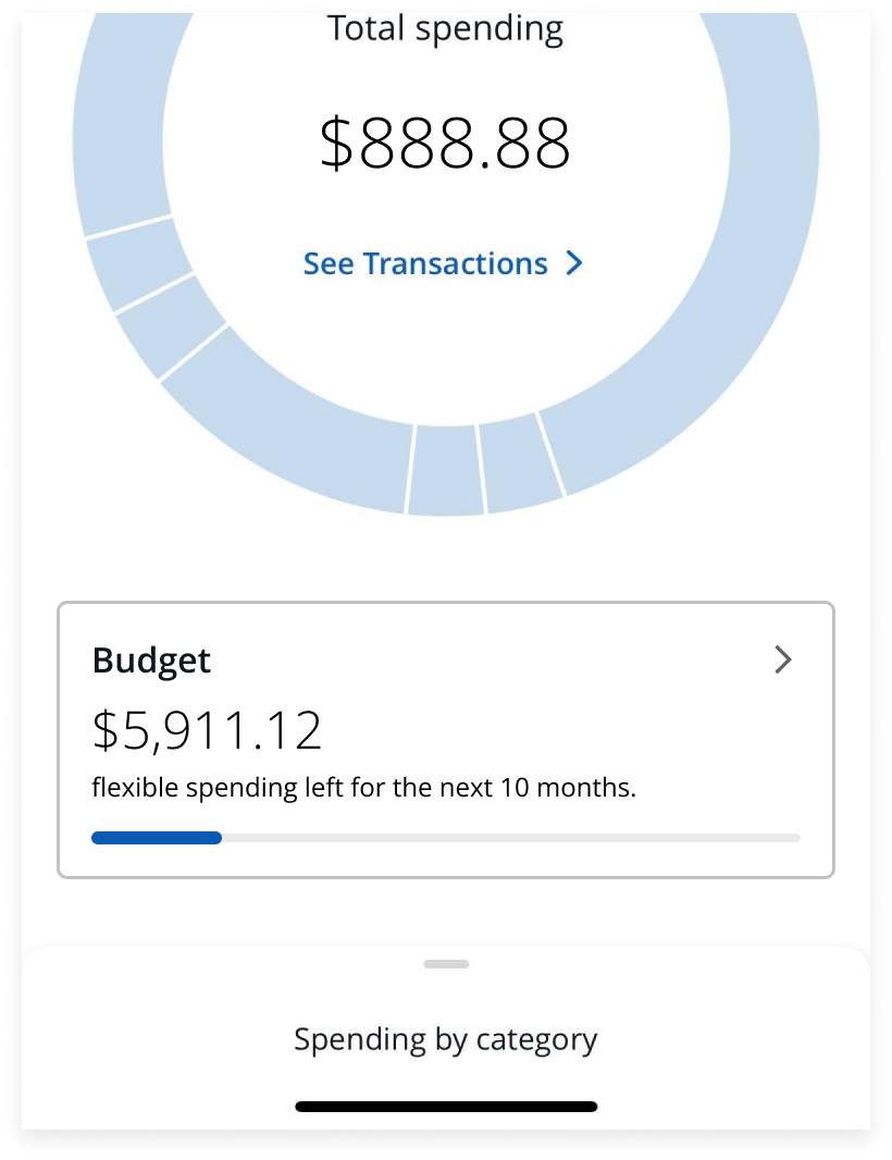
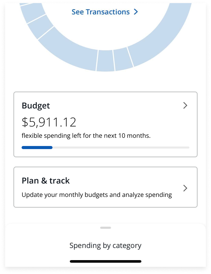
Condensed everything into one square with ability to go into 3 separate views within the Plan & track feature
Final iteration:
Prototype & Usability Testing
Prototype
The goal of the prototype was to test the flow and easiness of category updates, engagement of the newly incorporated entry points, and any other issues users are experiencing.
Usability Testing
Methodology:
Remote testing through a recorded video session of users sharing their screen with access to the Figma prototype and Maze tool.
Participants:
Ages 20-35
Previously used a tool to track spending or budget finances
Affinity Map Insights:
Overall, the new flow was a success! The main concerns I needed to address was presenting more clarity and resources for users to better understand the information shown.
Revisions
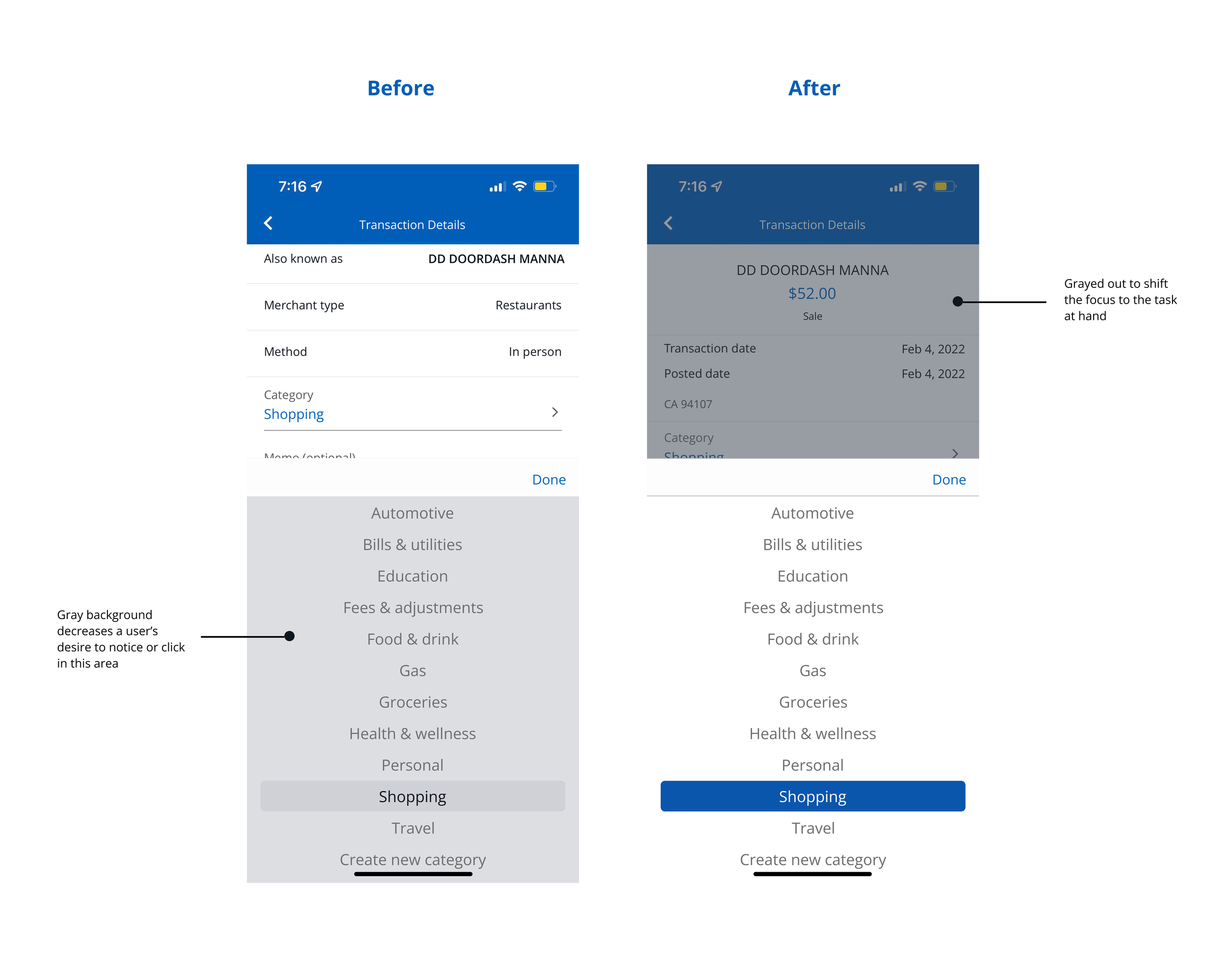
I reorganized the placement of transaction details based on the order users would anticipate. Next, I added a gray background overlaying all irrelevant elements when updating categories to help users focus more on the task.
An expandable information icon, category count, and a category summary page were also added for better clarification and understanding of each section.
Next Steps:
Revisit and identify more opportunities for feature refinement
Measure satisfaction and KPIs with the new updates
Here’s what I learn from doing this case study:
Prioritization is pivotal
Research could reveal a plethora of new problems and adjustments needed but I will need to prioritize the most impactful changes for the problem at hand.
Things may be out of your control
Many ideas that came to my mind were eventually simplified to conform with Chase’s existing UI, brand, and “design system”. Even so, I was able to pick up a few tricks to better work within existing brand guidelines.
Look at the big picture
This project gave me a glimpse of working on product maintenance and having to consider how my designs would affect other product features. Incorporating new flows to connect two features may have other questions and concerns to be addressed before deploying to production.