
A responsive design that considers a small business's new needs due to the pandemic.
Lucent Skincare
My Role: UX/UI Design, User Research, Brand Identity, Usability Testing
Project Duration: 80 Hours
Background
Lucent Skincare is a local medispa in San Francisco that aims to help their clients achieve optimum skin health while melting away stress with their relaxing ambiance and services. This is a responsive web design project that came about during a personal visit, in which the owner of Lucent Skincare expressed desires to regain customer confidence and revamp their brand following their reopening. As a loyal customer of Lucent Skincare, I saw this as the perfect opportunity for me to support a small local business during these unprecedented times.
Project Objectives & Challenges:
Lucent Skincare was inevitably impacted by COVID-19 which forced Christina, owner of Lucent Skincare, to close her doors for over a year. She is seeking to update her existing website for better user experience and centralize their overall brand identity. The goal is to enable previous and new clients to book services more easily and comfortably online.
Problem
Lucent Skincare’s current website has an outdated UI, hard to navigate and clients have trouble deciding which skin treatment(s) to book. This leads to clients leaving the website before booking an appointment and raises difficulty attracting new clients.
Click here to view their current website
Solution
A responsive UX/UI design utilizing a new design system to rebrand the existing website to increase bookings, ease of booking, and customer satisfaction.
Empathize (Research Method & Findings)
Research Goals:
“We want to understand the expectations and needs of current and potential Lucent Skincare’s clients to better guide them towards booking an appointment online.”
Research Methods:
Competitive Analysis - 3 direct & 1 indirect competitors based on their locations(all within San Francisco), 3 or more star ratings on yelp, and similar services offered
User Interviews - 5 participants who have booked services at a medispa within the past year
Competitive Analysis:
I found 3 overarching concepts that differentiate my experience between good and bad when trying to book an appointment for each competitor.
Ease of Use
Easily navigate between information
Assistance to find the right service(s)
Informative
Nest information to reduce a customer’s cognitive load
Provide useful information that would help customers prepare for their appointment
Reliability
Testimonials allows users to trust booking with the medispa
“Meet the Team” biographies help build rapport with customers
User Interviews:
I prescreened participants within the targeted age range(20s to late 40s) who have previously booked a facial or waxing services for a virtual interview. The goal was to understand what information is needed or pain points often encountered prior to booking an medispa appointment.
User Needs
Ability to weigh in the quality and authenticity of customer reviews
Clear description of service including ingredients and/or devices used
General information about the spa’s location, hours, and parking guidance prior to booking
Motivations
Recommendation from friends
Relies on third party website like Yelp & Google Reviews to read reviews and seek rating scores
Knowing a little bit about their estheticians prior
Frustrations
Difficulties locating the prices of each services
Professional jargons used in service description
Unsure of what the services can do for their skin
Insight:
I found that all participant’s trust is heavily relied on customer ratings and customer reviews. They need accurate descriptions of services and a clear correlation to what skin issues each service is able to help treat in order to decide what they want to book.
Define
Problem Statement
“Lucent Skincare’s clients want to book an appointment, but have a hard time navigating and understanding the information presented on the website.”
Persona
The findings in my research showed that some important factors prior to booking with a medispa include establishing trust with the facility and finding services that targets their skin concerns. Once a user finds a place that matches their expectations and needs, they tend to revisit because they would like to build a good relationship with their esthetician.
Our persona, Esther, takes into consideration the research findings as shown through her motivation, goals and frustrations.
Sitemap
The existing site’s navigation was confusing with long copy names and unnecessary links. Therefore, I reorganized various links, link copy and where information resided to better serve users.
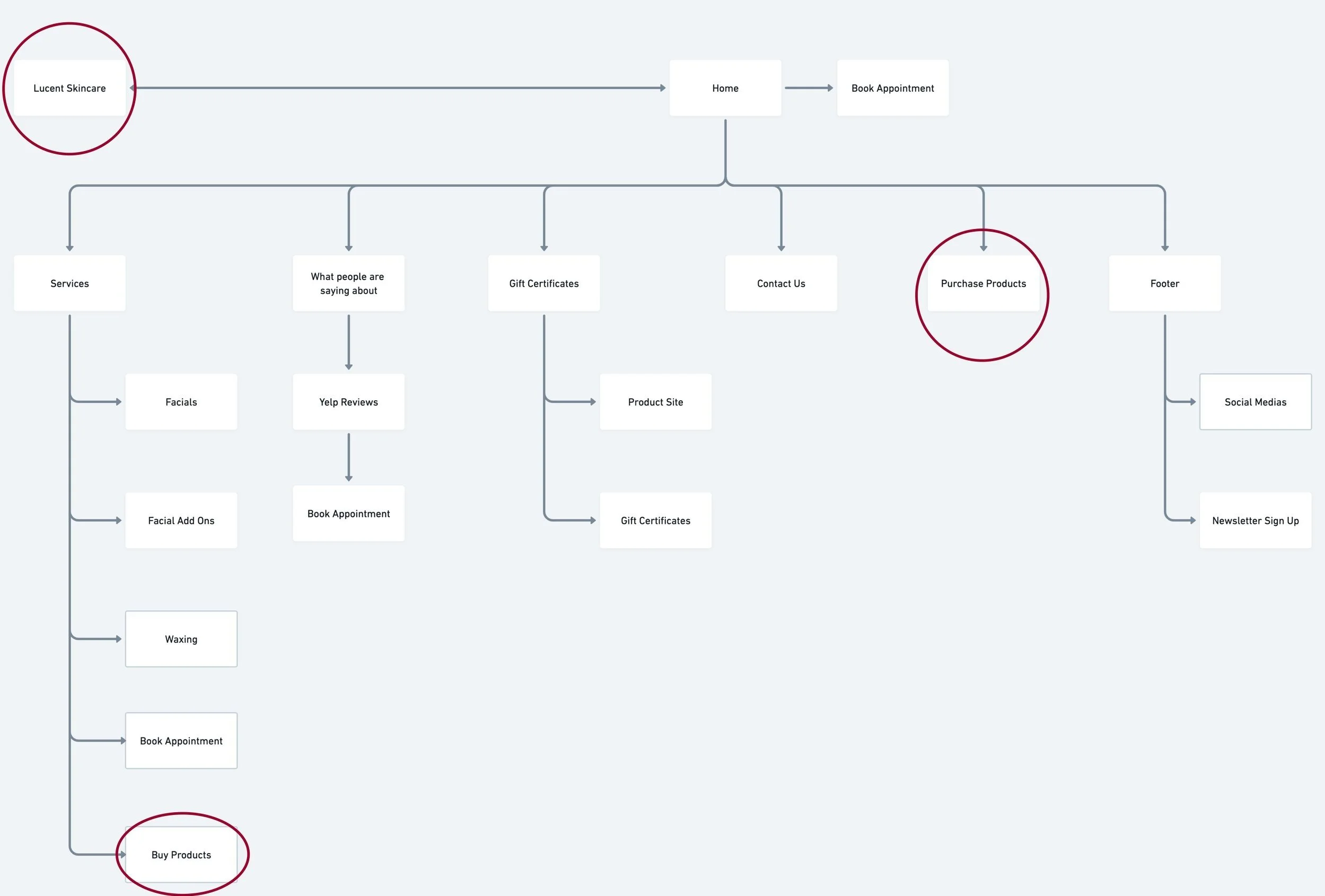
Existing Sitemap
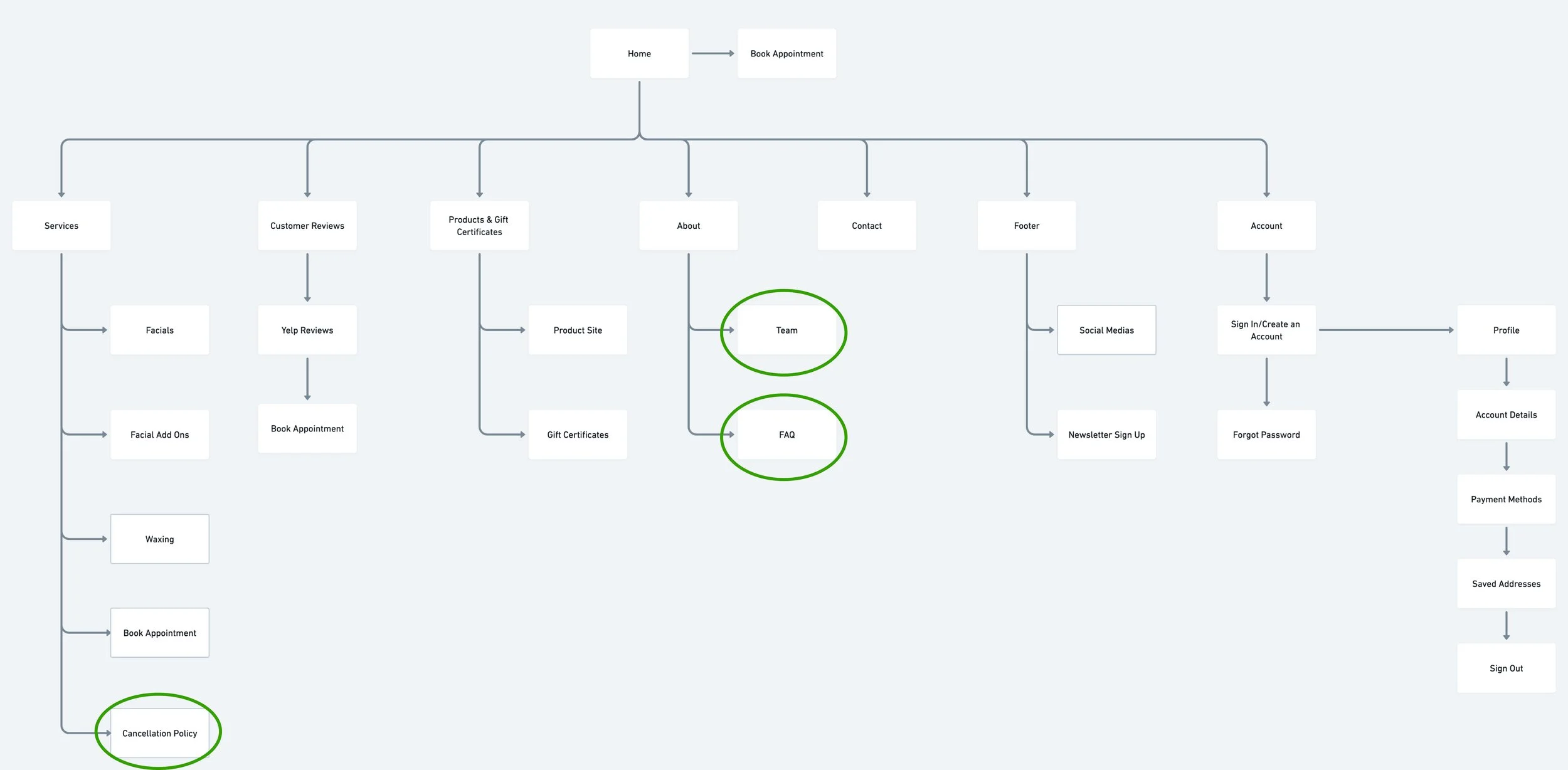
Revised Sitemap
Product Requirements
I laid out detailed requirements and pages Esther would need to accomplish her task of booking a facial for her specific skin concern. This helped me isolate which pages are absolutely necessary to wireframe so any Lucent Skincare’s client will be informed and can easily book an appointment.
Ideate
Low-fidelity Wireframes
Various service offerings and customer testimonials were two important factors identified in the Empathize stages that provided structure for my low-fidelity wireframes. Common design patterns used by competitors such as promotional banners, esthetician biography and gift guidance by occasion were incorporated in the design blueprint. Additionally, I added a facial quiz section on the homepage to help match users with the service they need and further promote a personalized experience..
Style Tile
As a small local business, it was understandable that there wasn’t a centralized brand identity or design system. To start developing these, Christina and I decided that the brand wanted to be seen as relaxing, friendly, and modern. This led to changing their old turquoise blue theme to a more comforting purple theme. Their typography was also updated from a basic Arial typeface to a combination of Playfair Display and Manrope for a more modern and spa-like feel.
Design System
Developing a new design system soon made me realize how an organized and extensive design library can help designers and a design team work cohesively and effectively.
Check out the first steps towards centralizing Lucent Skincare’s designs:
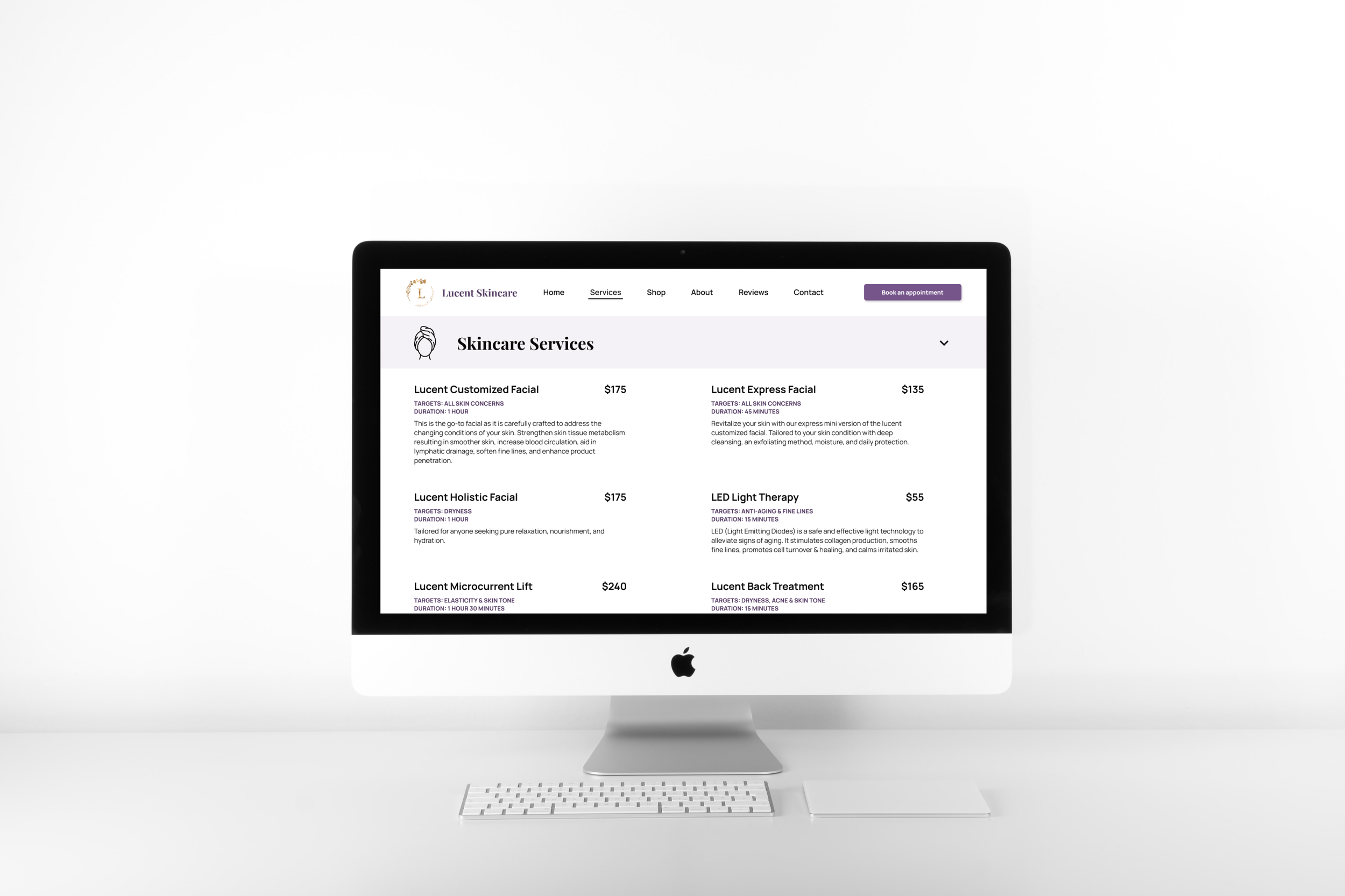
High-fidelity Wireframes
The detailed components and variants allow me to have more time to focus on alignment, spacing, and graphics.
Testing
Prototype
I focus the prototype on the three classification of findings from the primary research - ease of use, informativeness, and reliability.
The goal was to test if the new design and flow had any positive impact on a client’s online experience and their likeliness of booking an appointment. As it was unknown whether the existing service descriptions were written understandably, contextual questions were included to determine if any adjustments should be made. The newly incorporated visual & UI designs also needed to be validated for alignment with Lucent Skincare’s new brand identity.
Usability Testing
Methodology:
Remote testing through a recorded video session of users sharing their screen with access to the Figma prototype and Maze tool.
Participants:
Ages 20-35
Previously booked an appointment for facial or wax services
Results:
5/5 participants felt the placement of service pricing and descriptions was clear
2/5 participants further mentioned services descriptions can be difficult or too much to read
3/5 participants expressed concerns related to confusion with the About page
3/5 participants felt that the cancellation policy could be found somewhere else on the site
Insights:
When browsing the home page, users expressed delightfulness when they were able to quickly see testimonials and information about the owner.
Clean, fresh, and self-care were the most commonly described brand adjectives that the participants used. This proved that the new branding was successful and fit closely with Lucent Skincare’s redefined brand identity.
When tasked to locate certain information, most participants explore at least 2 different places or pages before finding them on the intended page. Based on observations, the contact page was the top visited page to seek information.
Affinity Mapping
Participants expressed that the cancellation policy and FAQs were not where they would’ve expected, which suggest revisiting where and how we can better nest and present that information. It was also clear that anything that was able to help users locate services that targeted their skin concerns would be highly beneficial in their experience. Therefore, participants were very interested about how the facial match section would’ve worked.
Top Concerns
Cancellation policy was not where expected
About page information was confusing
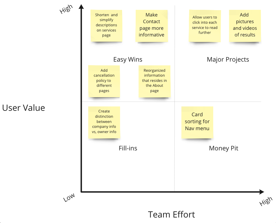
Opportunities
Simplify service descriptions
Indicate the duration and targeted skin concerns of each service
Revisions
Concerned about the feedback regarding sparse spacing of our navigational menu, I changed the left aligned navigation menu into a middle aligned menu so users can easily see linearly across the screen from the start of the page to the prominent CTA button.
Other notable iterations include additional visuals, simplified descriptions accompanied by targeted skin concern & duration of service, and increased accessibility for cancellation policy & FAQs.
Next Steps:
Rewrite copy aimed for novice clients
Speculate and analyze numbers of booking over a period of time
Maintain website through additional research and testing
Here’s what I learn from doing this case study:
1. Validate as much as possible
If time permits, validating more decisions in the early stages of the design process will allow me to gain better test results. Although this case study was driven by research and test findings, I still wished I had more time to validate my decisions. In the next design cycle of this project, a card sorting exercise or A/B testing would likely bring valuable insights about a user’s mental model around the navigation menu and where certain information should resided.
2. Build and contribute to a design system early
Components are as important and useful as you make them to be. Creating and compiling the components as soon as I can help speed up my high-fidelity wireframing process exponentially. Since this project was for a local business that outsourced almost every technical aspect of their experience, it was crucial to start building a design system for them to continue maintaining and updating their website. It will be the building blocks of a cohesive user journey and higher brand recognition for growth and success in the years to come. I also thoroughly enjoyed thinking through all the states needed for each microinteractions!