
A mobile integration of a mentorship platform to extend the reach of their services
ADPList
My Role: UX/UI Design, User Research, Design Brainstorm Facilitation, Usability Testing
Duration: 80 hours; 3 weeks
Background
ADPList is a mentorship platform that allows anyone and everyone to become mentors, book mentor sessions, and connect with industry professionals. Having worked as a teaching practicum & a firm believer in mentorship, it was initially a passion project to build a responsive design for mentoring services. ADPList’s existing product allowed me to accomplish my vision with the time constraints and resources available to me as a design student.
ADPList currently offers its service through a website and lacks a quick and on-the-go way to easily connect users with mentors and their peers. As an extension of my passion project, I took on a mobile integration of their existing product to integrate their mentorship capabilities to the convenience of our on-the-go users.
Problem
ADPList currently lacks a mobile integration of their desktop services that could be preventing them to increase account sign ups and the ability to target a lucrative demographic of mobile users.
Solution
A mobile application extending ADPList’s mentorship capabilities to a wider reach of users.
Empathize
Research Goals:
Understand how current and potential users uses ADPList’s desktop offerings and services to book and keep track of mentor sessions
Understand any common pain points/frustrations that they are experiencing with the existing website
Methodologies:
User Interviews - moderated virtual interview with participants who have booked a mentor session before
Competitive Analysis - 4 mentorship competitors chosen based the similarity of services being offered
User Interviews:
Participants:
6 participants
Ages 25-31
Previously booked a mentor session on any kind of mentorship platform
Insights:
It was revealed that 4 out 6 participants who have previously booked mentor sessions on ADPList indicated that their experiences with the current website were very positive. I also discovered the most commonly used features were..
Viewing a mentor’s profile
Adding the email confirmation event to their personal calendars
Checking mentor’s availability before booking
Filtering mentors by timezone and gender
Competitive Analysis:
I drew out key features based on what ADPList currently offers to their mentees and the overall goals discovered from user interviews. I analyzed 4 competitors to identify what services and features they had to understand what’s being offered in the industry.
I discovered that ADPList supersedes all competitors in every feature and having their platform offered as a mobile application is what will set them far(by a landslide) from their competitors.
Define
How Might We…
Provide sufficient information about a mentor for users to book a session with them?
Reduce the feeling of a dating app to promote professionalism within the platform?
Allow users to easily filter for what they want to locate a mentor matching their needs?
Easily enable users to keep track of session notes and resources?
Persona
Monica Bedasse represents all the users that were interviewed that had booked a mentor session on ADPList before. Monica wants resumé feedback from professional UX/UI experts in efforts to successfully transition her career, therefore, she needs to be able to filter mentors by industry, expertise, and their specialized services being offered. Before booking a session, she also needs to establish some rapport based on some similarities the mentor may have with her.
Task Flow
Establishing the persona, Monica, I was able to identify ADPList’s MVP pages for mentees of finding a mentor and booking a session.
Sitemap
Next, I noted down how each page flows within ADPList’s current website to organize the information hierarchy of the mobile sitemap.
Product/UI Requirement
Some of the detailed UI requirements I identified for the mobile application were a variety of filters, alerts/notifications for upcoming sessions, and calendar views of bookings. These requirements will allow users, like Monica, to better find mentors and track sessions.
Ideate
Style Tile & UI Kit
When developing the style tile and design system components, I realized ADPList utilized a variety of colors very well. They use various saturations of a color, while balanced on sufficient white space, to adjust the level of recognition they would like users to have. The balance of colors portrayed ADPList as a clean, vibrant, and inviting brand, which was something I needed to ensure I brought into the final solution.
Co-Design Sessions
To kickstart solution thinking, I facilitated a 30-45 minutes of design brainstorming with each of the 4 designers recruited from my DesignLab community. I utilized these sessions to collect and collaborate on possible solutions for 3 main user goals:
“I want to expand my knowledge or receive feedback about something from industry experts.”
“I want to find a mentor to book a session with them.”
I” want to efficiently track and organize my bookings. “
Collaborating with other designers was a great opportunity to flush out ideas and flows that actually didn’t make sense or shouldn’t be prioritized.
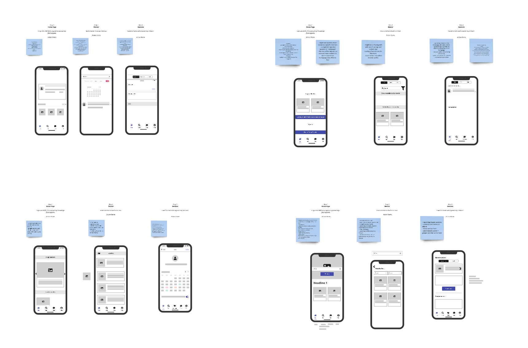
Low-fidelity Wireframes
My co-design sessions were extremely useful in constructing my low-fidelity wireframes. I was able to incorporate things like segmented controls, reminder on/off toggle, and calendar overview.
Following some feedback from my mentor, I decided to move search to the middle of the main navigation menu to center the main purpose of the application for a mentee.
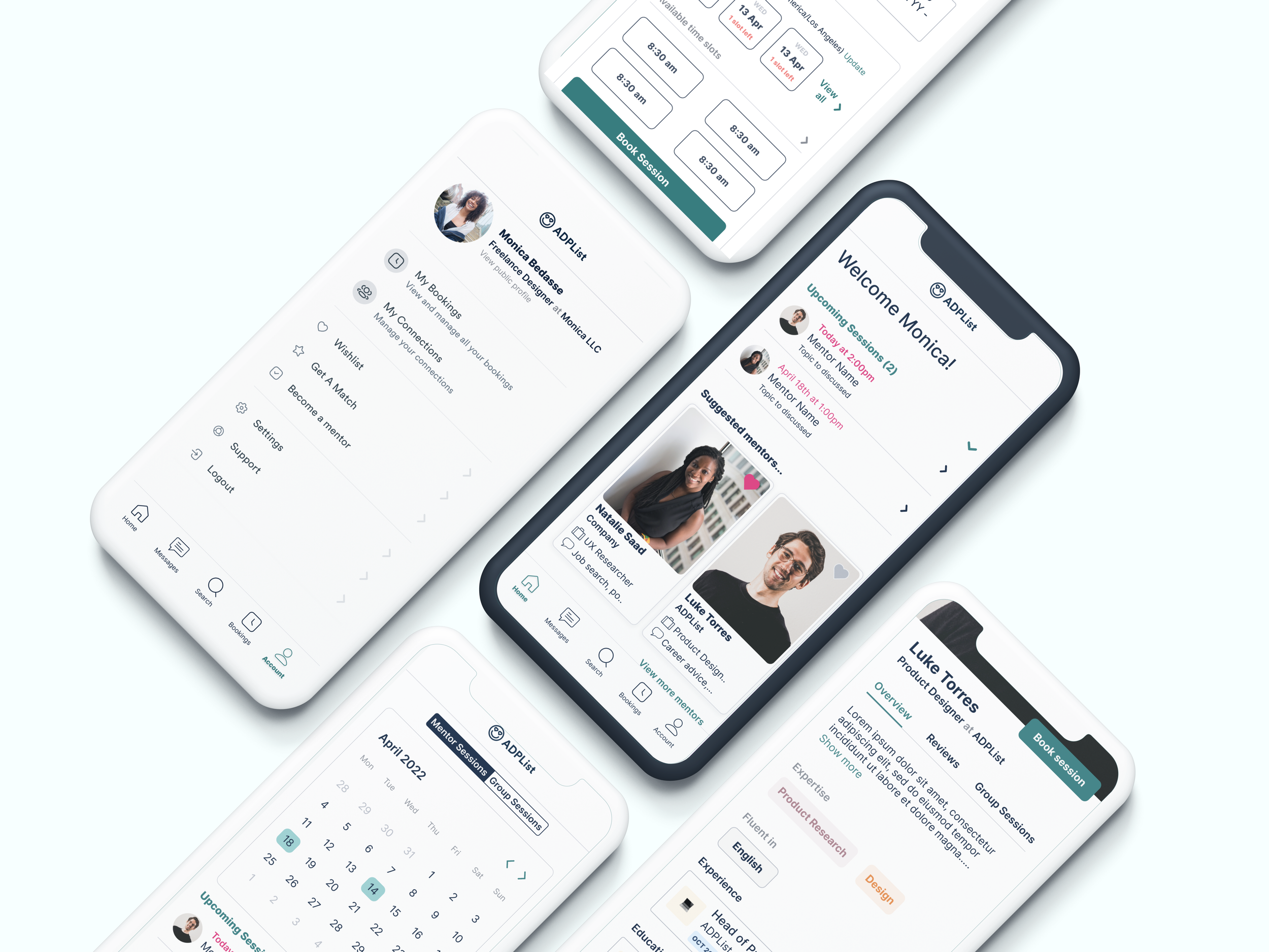
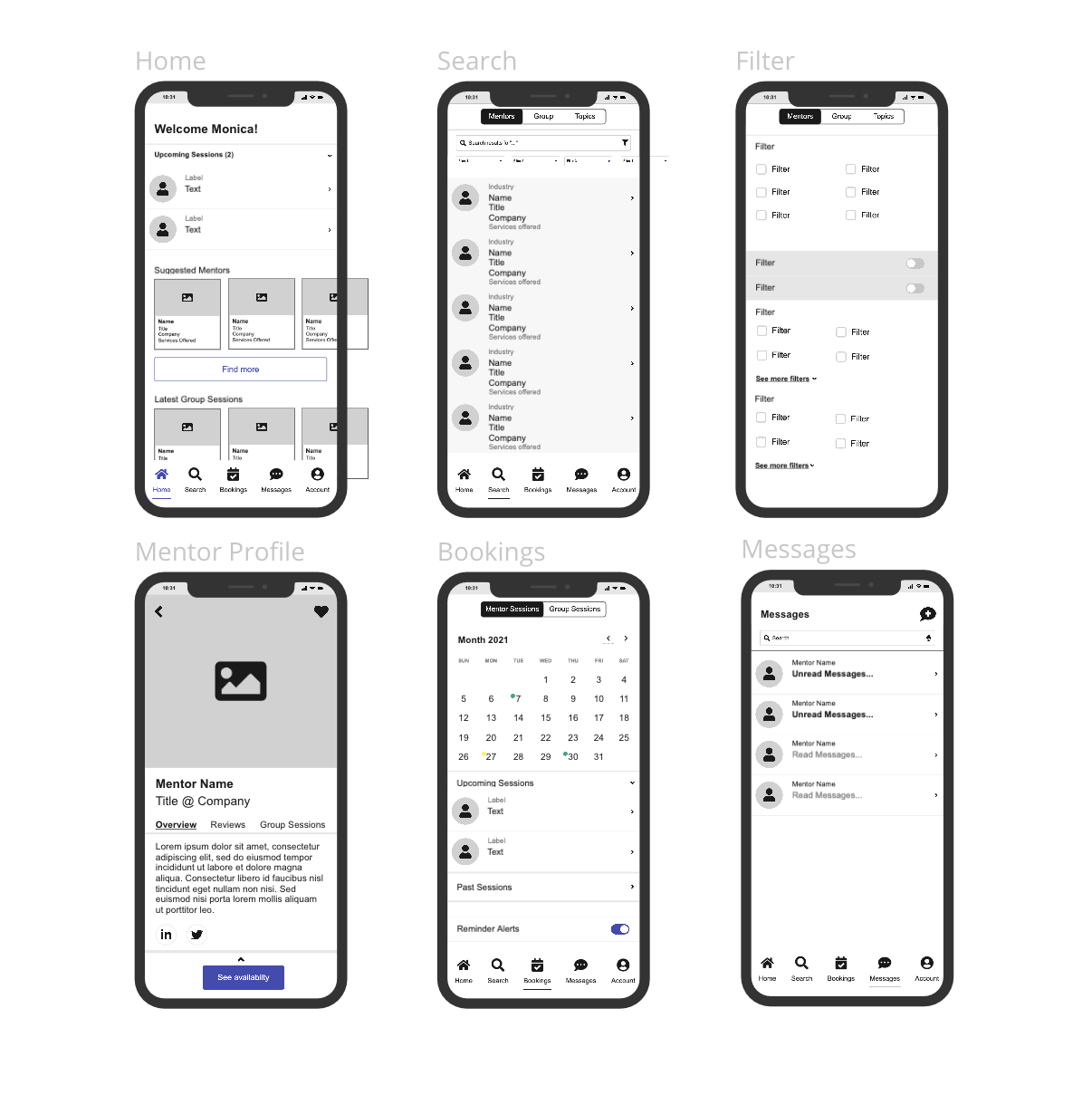
High-fidelity Wireframes
The hardest part moving to high-fidelity was aligning my low-fidelity ideas to ADPList’s brand and style so I tried to simplify by limiting colors and contextual copy as much as possible.
Usability Testing
Plan & Prototype
Building from my high-fi wireframes, I built out the flows to be tested for finding a mentor, filtering mentors, booking a session, and tracking/organizing sessions.
Testing
Methodology:
Remote testing using Maze and virtual testing session with Figma prototype.
Participants:
3 participants
Age 25-31
Insights:
The MVP tasks were very successful in completion and ease of use.
Revisions
I prioritized impactful, yet minimal effort required solutions such as..
More booking confirmation so users are reminded that they had booked/requested a session with the mentor while going back to their profile
Ability to edit session details
Incorporating more CTAs to find mentors/book a session
Adding the # of mentor reviews to the search result page
Next Steps:
Refine mobile application UI to better align with ADPList’s branding
Measure satisfaction and bookings of new mobile integration
Perform design cycle again to make continuous improvements
Here’s what I learn from doing this case study:
Collaboration produces better solutions
This is probably a given, but the opportunity to work with other designers really opened my eyes to the endless possibilities that lie within collaboration. I got better results & solutions, inspirational ideations, and most importantly, all collaborators come out of the process widening their perspectives.
Familiarize and continue learning design tools
It’s crucial to learn and master your tool choice. This project pushed me to play with Figma’s and Miro’s capabilities and it has changed the ways I approach and complete certain goals & deliverables. I’m continuously learning new ways to better utilize various design tools and would love to hear your favorite tips & tricks!